UE5 Demo Level |
|
All of my recent level design work (about 5 years' worth) is locked behind NDAs. I don't even know if any of it will make it through to the final games. For that reason, I've been working on a demo level in UE5. It's kind of like a level for a game that doesn't exist. My goal with the project was to demonstrate:
|

|
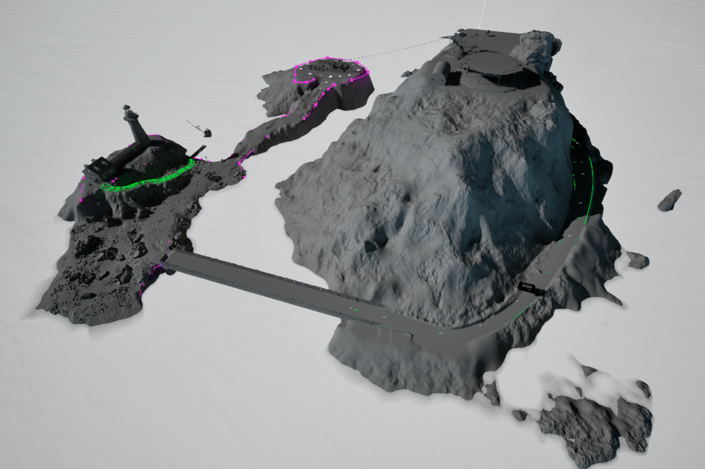
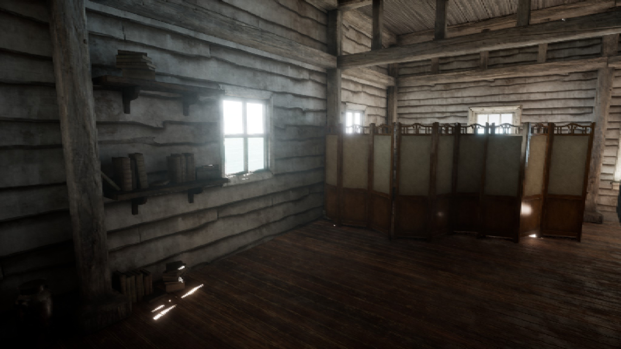
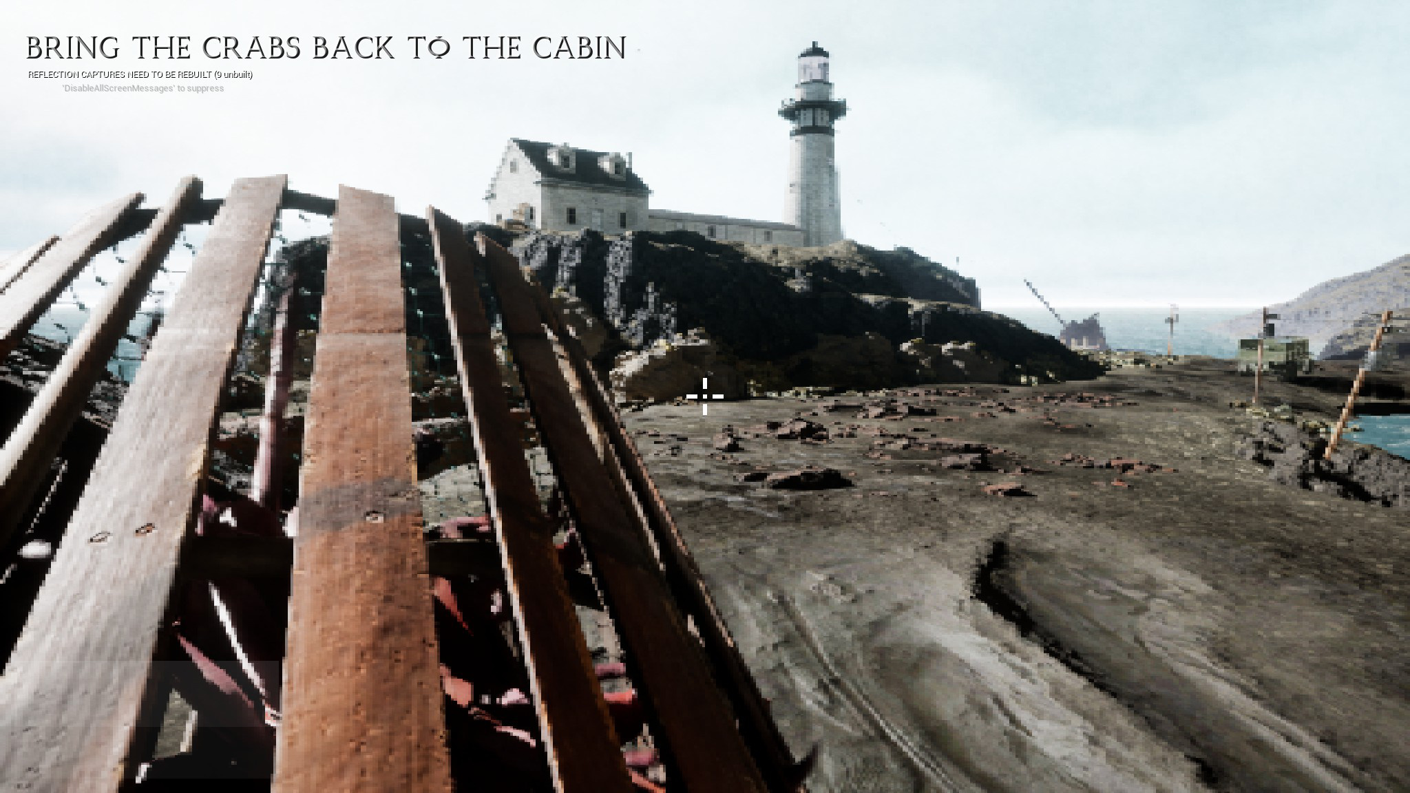
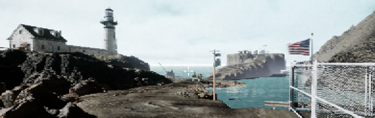
ParametersConstrained ScaleTwo small islands with one building/interior each. This would allow me to showcase both natural outdoor layouts and man-made indoor spaces with more interesting lighting. One interior would focus on comfort and familiarity while the other would be complex, unfamiliar, and experienced under (mild) time pressure. |
|
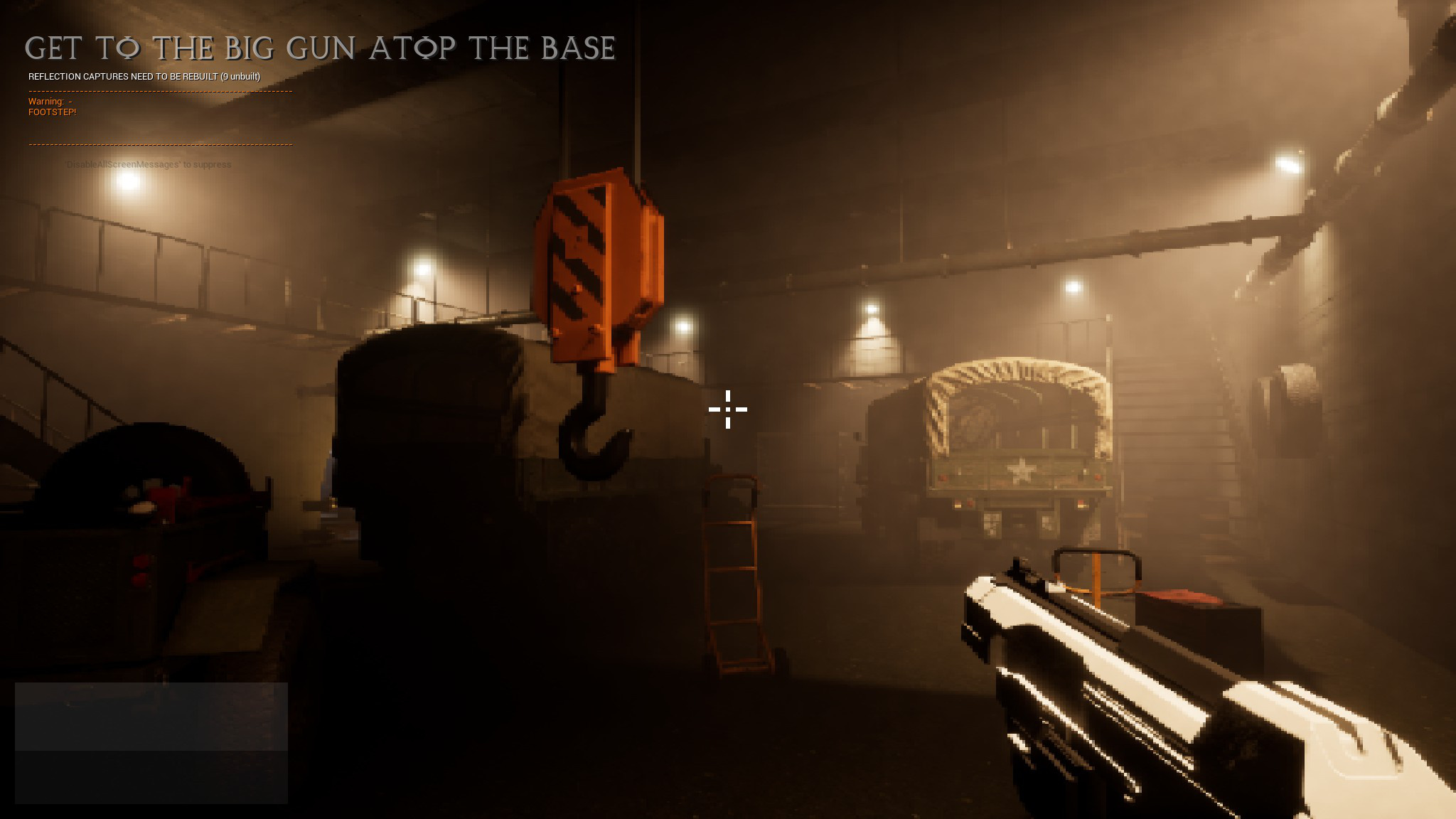
Don't Reinvent the WheelThe idea was to use marketplace assets for anything that isn't usually considered a "level design task." This was important because I've worn a lot of hats, but I knew I'd never finish if I tried to make every asset myself. Even with this guideline, I ended up making more assets myself than I intended simply because I couldn't find preexisting assets that matched what I needed. My target was about 50% "walking simulator" and 50% FPS, so my only foundation was an Unreal asset called "Firearms Evolved". This handled basic movement, sprinting, jumping, and weapon behavior. I later regretted this choice as the role of combat shrank over time (see "What I'd Do Differently".) |
|
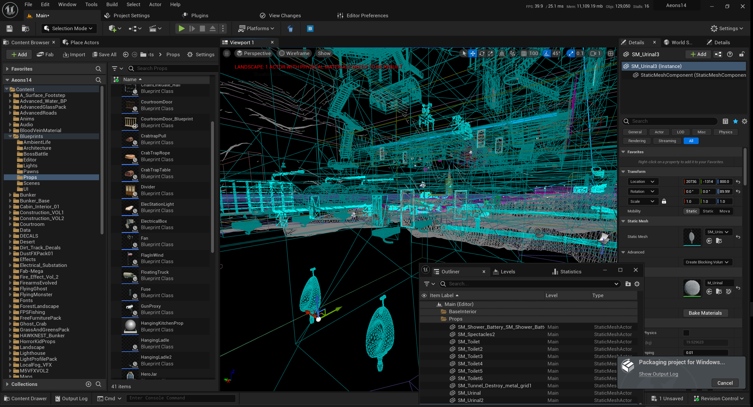
Unreal 5I was determined to learn as much of Unreal 5 as I could during production. I have lots of experience with Unity and Source/Source 2, but I've spent less time with Unreal. At the same time, many studios have been moving away from Unity and toward Unreal. So by the time I was finished, I wanted to understand the engine inside and out. |
|
Allow a Short, Interesting Story to UnfoldAs a sort of experiment, I didn't want the player character to be a blank slate. Rather, she's a specific individual in a specific context. At the same time, I didn't want the player to know anything about that context initially. Rather, it would unfold over the course of the first day. Showing, rather than telling, would be critical. Then on the second day, the protagonist would be thrust into dangerous, unfamiliar territory. As a bonus, this would give the player an opportunity to get familiar with the world and its mechanics before having them tested. |

|
IndulgencesAmid all of my pragmatic goals for the project, I still wanted to have fun making it. I'd never worked on anything like this before - an entire (small) game in which I got final say on every decision. I wanted to make the most of it. My priorities were:
|
|
ShowcaseEverything involved in the following elements is an entirely original implementation - not based on any existing asset, with the exception of the TV model. |
|
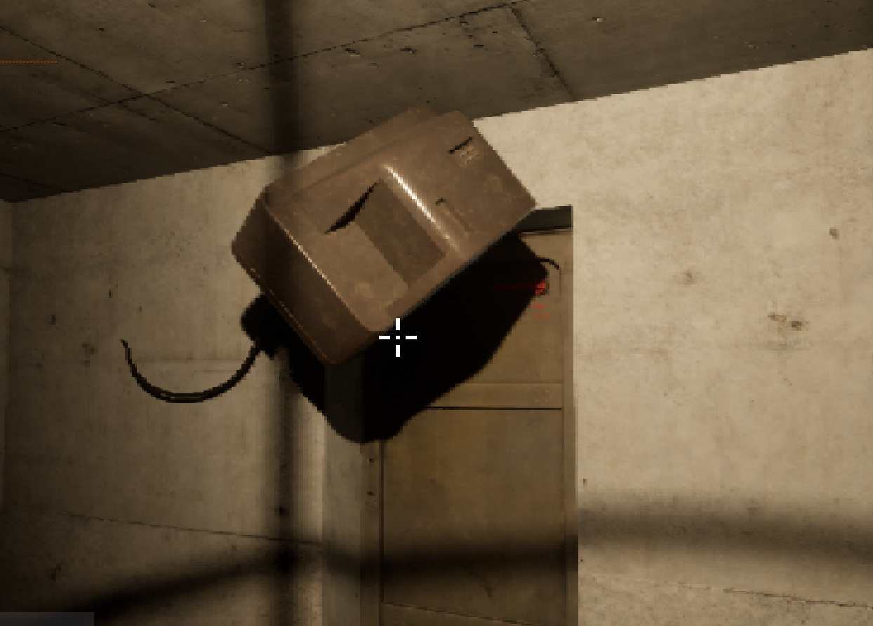
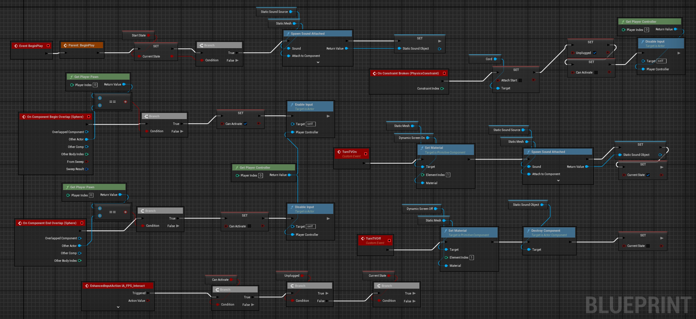
"Bouncer" TVCertain mundane objects in this world, for Reasons, resist gravity. Furthermore, they exhibit an odd behavior when they collide with other objects - they come under the influence of that object's own gravitational pull. This results in a them gently "sticking" to whatever they hit. I used this class as a basis for a functional television set. It can be turned on and off by activating it, with appropriate screen and audio static as well as dynamic lighting from the screen as it floats around. Furthermore, it starts plugged into an outlet. The cord behaves like a constraint, and will prevent it from floating away if pushed gently. However, if pushed hard enough, the TV will get unplugged and float off freely. (Of course, once unplugged, it will lose power and can no longer be turned on.) It's a just bunch of Blueprint parlor tricks stuffed into a trenchcoat, but it makes for a fun little toy with several different levels of interactivity. (And yes, in retrospect, "Bouncer" is a bad name for a class that makes geometry stick to other geometry. The behavior was a bit of a happy accident, and I haven't gotten around to renaming it.) |
|
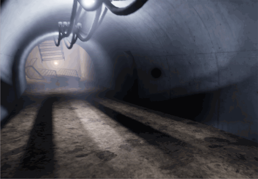
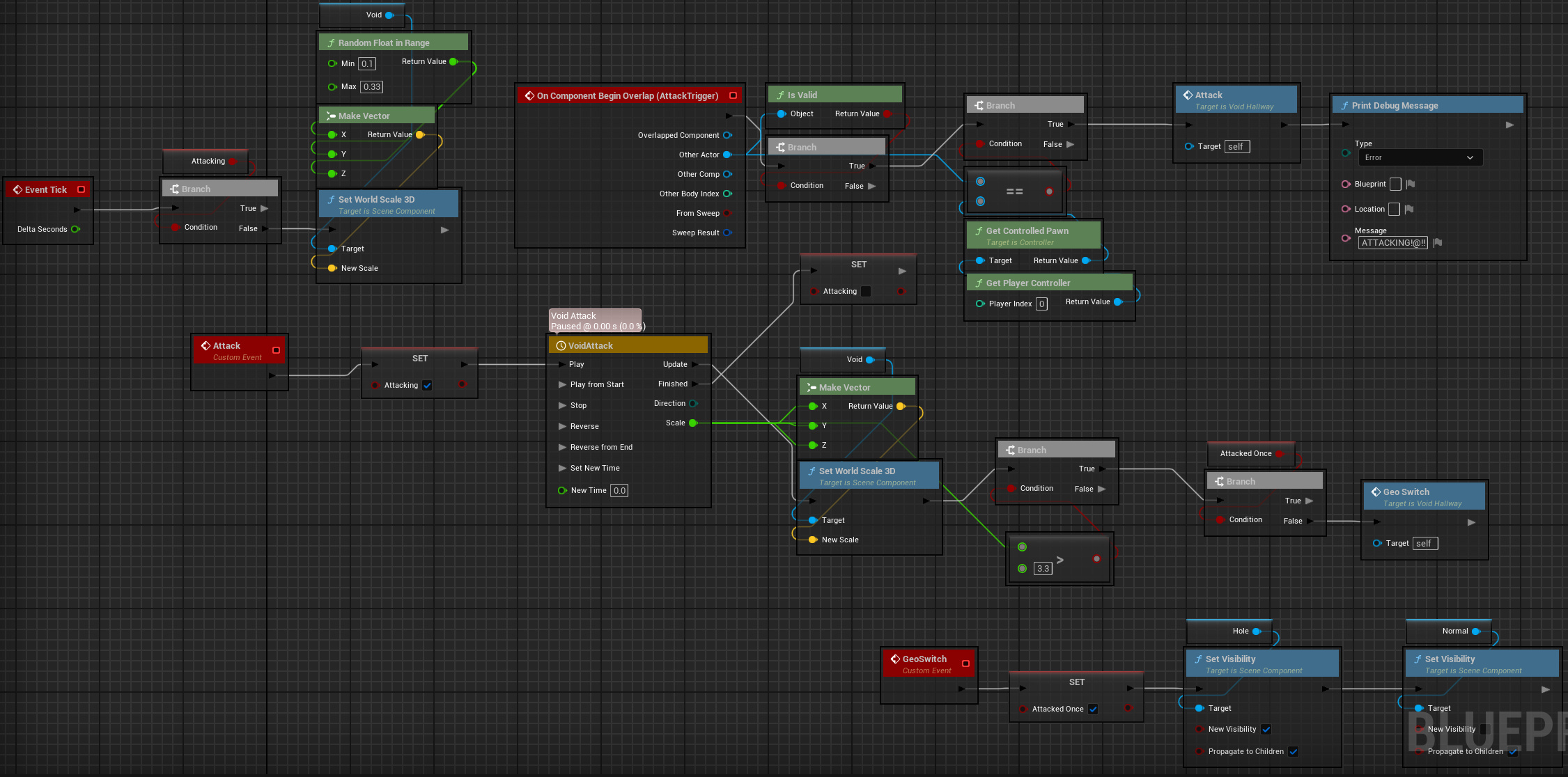
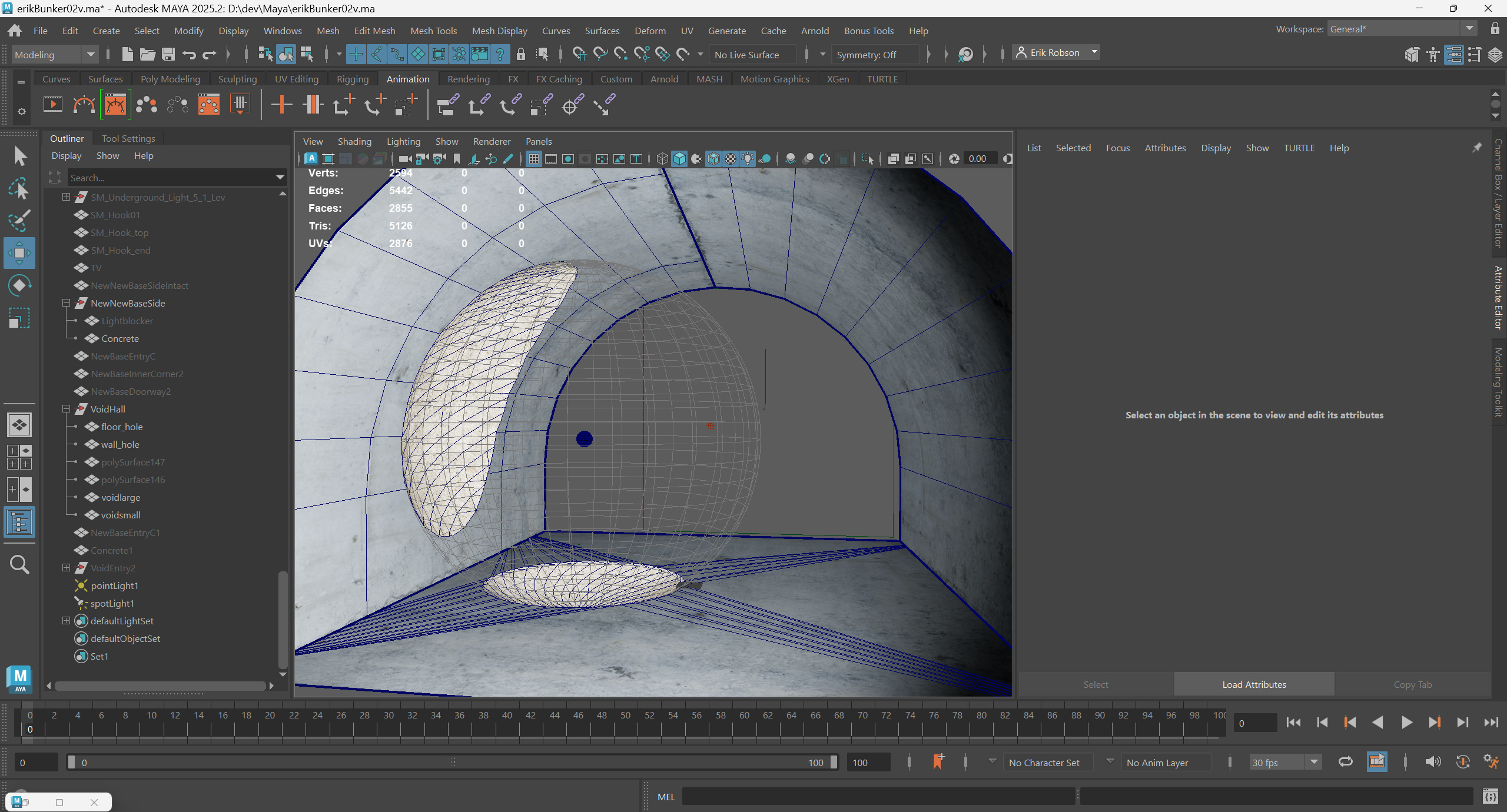
4D VoidAnother anomaly found in the old Army base is the unstable void - a "hole" of empty 4D space intersecting 3D space. It's sensitive to nearby movement and will expand abruptly, annhilating any 3D matter within the expanded hole. This is my demo level's STALKER influence showing through. It's a stationary hazard that follows a predictable set of rules. In its idle state, it pulses wildly, changing scale every frame to a random float within a defined range. It has a screen-facing refraction sprite attached, creating a "bent space" effect around its perimeter. When the player gets close enough, it will expand quickly, killing the player if they're within the area of the large void. Critically, the trigger radus for the void expansion is larger than the size of the expanded void. Thus, the player is unlikely to be affected unless they're carelessly running down the hall and willfully ignoring everything around them. The implementation is parlor tricks again, of course: A simple geometry swap. I made the post-expansion geo in Maya with booleans. The module's starting state uses default base geo, and the expansion event switches them. Luckily, as long as I'm having a Good Lighting Day and Unreal is behaving, both pre- and post-geo gets lit correctly and accurately, making the swap impossible to detect. (It helps that the expanded void tends to fill the view.) |
|
What I'd Do DifferentlyAs with any project, I learned a lot along the way. Here are some things I'd do differently if I were to restart it from scratch today. |
FoundationInitially I expected combat to be a larger portion of the level's gameplay. As things evolved, its role diminished. If starting fresh, I'd use an asset called "Horror Engine SE". Out of the box, it brings a much richer palette of player actions - ladders, inventory, video/input settings menus, footsteps, and a bunch of other stuff under the hood. During development I spent about a week evaluating whether I could viably restart with this as a foundation, but Horror Engine lacked flexibility in some key areas that were non-negotiable. If restarting today, I think I'd probably choose to put in the work to make those "non-negotiables" work within the HE framework. |
Tri-Planar ShadersTri-planar shaders were a welcome return to "classic" brush-style level design techniques, giving me the flexibility to stretch and squish geo as necessary to lay out basic architecture. What I didn't take into account, of course, is that tri-planar materials don't magically confer adaptive tri-planar lightmap UVs. So stretched and squished geo still suffers from broken lighting. There's probably a way to do it, but I wasn't able to find or figure out a way to apply proper tri-planar UVs so that lighting looked right. |
|
No Game Engine is PerfectUnreal 5 actively generated substantial hurdles at times:
|
Less Blah Blah, More Playable Demo PleaseI'm right there with you, believe me. I'm in the final stretch, and I promise I'm going as fast as I can. |
|